
Category: General
")
Live from SHARE 2017: Collaborative Mainframing (revisited)
(This post originally appeared on the Rocket Software Blog)
I was delayed by 24 hours getting to this week’s SHARE conference in Providence, Rhode Island – more than 10,000 miles from my home in Australia. I was onboard my first flight  from Sydney to Los Angeles when the captain announced that there was a problem with the “onboard mainframe” and they were going to have to reboot. Now I had no idea that aircraft run on onboard mainframes…or whether it was actually a mainframe…or how to reboot one. Does one use CTRL-ALT-DEL? Do you just turn it off and back on again? Some wise guy onboard suggested loudly that they “Call Bill Gates.” I don’t know how much this Mr. Gates knows about mainframes. Not much it would seem, because after about two hours the captain announced that the mainframe wasn’t collaborating (he may have said cooperating, but at that point I was a little preoccupied), and the flight was cancelled.
One problem with collaboration in the workplace is that it’s often devoid of all the facts – the supporting data. Decisions are made on the basis of hearsay and assumptions, rather than empirical evidence. But if you repeat a lie, or a false assumption, often enough does it become the truth? What value do we place on facts?
There is a lot of rich, valuable data stored on mainframes that could help support fact-based decision making and avoid false assumptions. But how easy is it to get to? Because when you think about it, a mainframe without timely, easy, responsive, flexible access – a mainframe where an IT department has to extract the data and load it into some kind of data warehouse in support of the business decision-making process – is really just a glorified, multi-million dollar file server.
So, what is “collaborative mainframing?” Is it a real thing? The answer is yes!
Imagine a scenario where, as an executive, I have multiple inputs to consider as I plan my business. Some operational data may come from the mainframe, some data from external or third-party sources and be in spreadsheet format, some data may come from our budgeting systems. Now imagine I have time pressure to make a particular business decision (who doesn’t, these days?), to pull together this information, interpret it, add some context and share with my team to reach a consensus decision. How am I going to do that?
As younger people are entering the management ranks, we are seeing a shift from “management by exception” to “management by analysis”, a new breed of business user who are data savvy yet information poor. As Inhi Cho Suh, GM, IBM Collaboration Solutions recently observed: “We’re going from a typing and texting culture to a culture of conversations.” A cognitive business empowers us to work as part of a seamless flow of information and conversations. It exploits our natural inclination for teamwork and creative collaboration. Data has little value without context, but by making mainframe data more accessible in support of a more holistic business view, we can leverage these information assets like never before, this can be one of the ways of how to achieve efficiency in business.
As Charles Darwin is quoted as remarking, ”It is the long history of humankind (and animal kind, too) those who learned to collaborate and improvise most effectively have prevailed.” In the increasingly complex world of today, we need ever more timely, iterative, collaborative approaches to decision-making, regardless of where our supporting information resides. If we can do this effectively, then our business really can “take flight.” THAT is the essence of collaborative mainframing.

BI Governance in the world of Self-service Data Preparation and Data Discovery
Self-service BI platforms provide significant benefits, however, they have also contributed to a new trend: the “wild wild west” of proliferating BI silos, inconsistent business definitions, no data lineage, no single version of the truth. “Spreadsheet hell” has been replaced with “Self-Service BI hell”.
As Boris Evelson (Forrester Research) recently commented to me via email: “We increasingly hear from our clients that BI silos are now proliferating. Basically these platforms are now becoming the new spreadsheets”.
And that introduces risk. In a recent article in The Economist (“Excel errors and science papers”) it was reported:
“…they had accidentally omitted five rows of their spreadsheet when calculating an average. When included, the missing figures weakened the paper’s conclusion substantially.”
OMG.
Self-service is all about speed and agility, allowing business users to follow their own intuition, answer their own questions, rather than having to rely on IT. In the 1990’s, we used to call it the “next question dilemma”: It’s impossible to predict the next question a business user is going to ask, until they’ve seen the answer to their previous question. Collaborative, self-service data discovery needs to be iterative, exploratory. As people’s reliance on modern technologies has grown, various payroll software businesses have developed their own systems but what are the consideration when it comes to payroll softwares?
But can the “need for speed” in business decision-making be reconciled with the need for Governance? According to Howard Dresner, Governance of BI content creation and sharing correlates strongly to success with BI, improving information consistency and accelerating group-based decision making.
In this context, “BI Governance” includes things like BI lineage, impact analysis, facilitating collaboration and content reuse, reducing content duplication. In  the BI industry in general, we’ve seen what Wayne Eckerson recently referred to as a “pendulum swing” – away from (over) governed BI to un-governed BI. The pendulum is now swinging back, because business users are now starting to ask questions like:
- How do I trust the decision being made?
- How trustworthy is the data? How timely is the data?
- How do I communicate the decision, the thought process behind the decision, the facts supporting the decision?
An added complexity results from the increasing number of additional sources of information available to a business user. I was recently talking to a customer in the Financial Services industry, who was explaining that they receive data such as AML (Anti-Money Laundering) data from external sources, usually in a flat-file format. The users need to merge/blend these data sources with internal data, in order to produce their dashboards and reports, in support of their business decision-making. Due to the time-sensitivity of the data, the users needed more of a self-service approach to the data preparation, but still have some governance in order to retain confidence in the information being communicated.
In another example, a business user at a Government customer used to complain that the BI content they received had no “context”: what am I looking at? What does this number mean? How was it defined? When was it updated? What is it filtered on? It continues to surprise me, after 25 years working in the BI industry, that most BI output still doesn’t contain this kind of basic contextual information.
Hence, perhaps, the number of business meetings which are still dominated by debates about the numbers, who’s “version” of the numbers are correct, instead of actually making productive, collaborating business decisions.
 I’m reminded of something I noticed on a Deep Purple record “Made in Japan”, recorded back in 1971. Ian Gillan, the vocalist, can be overheard asking the sound engineer: “Yeah everything up here please. A bit more monitor if you’ve got it.” To which Ritchie Blackmore, the guitarist, adds: “Can I have everything louder than everything else?”
Without effective, governed self-service data preparation and data discovery, the information becomes noise, trust in the information is diminished, and effective collaboration becomes much more difficult. Everything is louder than everything else.
“It takes two to speak the truth – one to speak, and another to hear.” – Henry David Thoreau

Innovation
This blog post was originally published on the Rocket Software Blog
I was recently asked by a Rocket Software Business Partner, Pentana Solutions, to give a talk on the topic of “Innovation”. Specifically:
- How do companies promote innovation
- How do companies create a culture of innovation
- How do companies prioritise and manage the Business As Usual Vs. Innovation
At first, I was a little perplexed. What do I know about Innovation? However, as I mulled over the topic, I saw parallels in my own work and home life. At work, in Rocket’s Sydney R&D Lab, we are innovating daily to build a truly user-focused, self-service, Cloud/mobile-enabled data discovery & exploration solution for our customers. At home, I struggle daily with the challenges posed by a study of jazz guitar: creativity, improvisation, innovation.
The first ‘lesson’ I considered is summed up by the words of educationalist Sir Ken Robinson, in a recent TED talk: “If you’re not prepared to be wrong, you’ll never come up with anything original“. Or as my jazz guitar teacher says, “Letting Go” – letting go of fear and inhibitions. Creating a culture of trust, removing or reducing fear of failure, creating an environment when team members feel empowered to think “outside the box”, these are all key elements to promoting originality, which leads to innovation. This ‘culture’ needs to be enabled at the individual level, at the team level, and at the organisation level. For the latter, the organisation needs to consider it’s ‘brand’, the image it wishes to portray. A stodgy, outdated website, or bureaucratic hiring processes are not going to attract the kind of “creatives” you want to employ in the first place: people with an aptitude for creative thought, a passion for innovation and change.
When Steve Jobs talked about his Macintosh development team at Apple, he talked about “..musicians and poets and artists… who also happened to be the best computer scientists in the world”. He talks about “trying to expose yourselves to the best things that humans have done”. Get out of the office, take a walk, get inspired by the ideas of others, mix things up..
”Habitual thinking is the enemy of Innovation”
(Prof. Rosabeth Moss Kantor, Harvard Business School)
“It’s not where you take things from – it’s where you take them to.”
(Jean-Luc Godard)
Another important consideration is that Innovation can come from anywhere – it’s not just about product. Any process, any service can be improved. Sometimes the small things get overlooked, but innovative thinking could yield big improvements in unexpected areas. Be open-minded and willing to challenge perceptions. As Nolan Bushnell comments in his book “Finding the Next Steve Jobs”, Neutralize the Naysayers (“any idiot can say no”)
One often overlooked aspect of innovation is the thinking process itself. A great way to create ‘space’ for innovation is to give people time to think. Treat is as part of everyone’s job, make it a KPI. “Hackathons” and “Innovation Jams” are great, but innovative thinking should become part of everyone’s default thought process: how can this be improved? Allocate time for the thinking process. People like to create, like musicians with a tune in their heads. Our job is to capture and focus this creativity. Give space to people. We need to orchestrate, provide a vision, then allow the creative ‘juices’ to flow.
Another key to allowing this ‘culture’ of innovation to flourish is, of course, hiring people with an aptitude, attitude or predisposition towards creative thinking. Hire for passion and intensity. For example, when we hire front-end developers at Rocket, we don’t just look at javascript test scores, we look for passion, energy, creativity. Does the candidate want to be challenged? Is the candidate comfortable having an opinion? Does the candidate show initiative, intuition?

”Innovation is a state of mind”
(James O’Loughlin, The New Inventors)
Simplicity
A key area when it comes to Usability and User Interface Design, is Simplicity. Over the 20+ years I’ve been working in the Business Intelligence industry, it’s often seemed like simplicity has been the last thing on the software vendor’s minds. Yet when attempting to design a product for an end-user, self-service audience, rather than a ‘tech-savvy’ or IT audience, intuitive usability is critical. If a 4 year old child can use an iPad intuitively, why should a 40 year old executive have to struggle with some counter-intuitive, poorly designed piece of business software? It doesn’t make sense.
In John Maeda’s book ”The Laws of Simplicity”, he comments “Simplicity is about subtracting the obvious, and adding the meaningful”. Simplicity is about clarity, brevity, refinement, restraint.

“Simplicity is the ultimate sophistication” (Steve Jobs)
“What is sought in designs is the clear portrayal of complexity…”
“…not the complication of the simple”
Edward R. Tufte, The Visual Display of Quantitative Information
Rocket Software constantly questions, reevaluates and revalidates its assumptions, talking to customers and partners, clarifying their assumptions and needs. We try to assume nothing. And as we continue to develop exciting new products such as Rocket Discover, I personally try to keep the following thoughts top of mind:
- Inspire yourself to inspire others
- Challenge the status quo
- Suspend disbelief and cynicism: Believe in the art of the possible
- Empathize – Listen – provide a ‘context to create’
- Empower the team


The Need for Speed
At a Big Data conference recently, IBM presented the following slide:

Interestingly, IBM also predicted that 1/3 of consumer data will be stored in the Cloud by 2016, and that 80% of new apps will be distributed or deployed via the Cloud. (IBM also once famously predicted that there would be a world market for 5 computers, which will perhaps one day be viewed as equally laughable as the Australian Prime Minister’s recent assertion that 25mbps Internet speeds are “more than enough”…)
The implications of Cloud Computing + Big Data are: exponentially more Internet traffic and therefore a need for faster, better, more reliable Internet services. A “Big Data Explosion” is certainly underway, and the implications for technology infrastructure are clear, as I attempted to illustrate with this graphic.

As discussed previously (in The Law (and Danger) of Averages), the problem with statistics, such as averages and medians, is that they are often misunderstood, and can be misleading. For example, if I have my left foot in the freezer (0 degrees) and my right hand in the fire (1000 degrees), and my body temperature is 40 degrees, then what temperature am I? Am I ok? My average temperature could be calculated as (0 + 40 + 1000)/3 = 347 degrees. My median would be (0, 40, 1000) i.e. 40 degrees. In this case the average indicates that we have a problem, the median does not.
So, in the case of so-called ‘median internet speeds’, what does this mean? Well, it depends on the methodology used to calculate the median. How was the measurement taken? When was the measurement taken? If it was taken at 5pm on a weekday, that would be different to if it was taken at 3am on a weekend, for example. Without such information, the measurements are pretty much useless for drawing any meaningful conclusions.
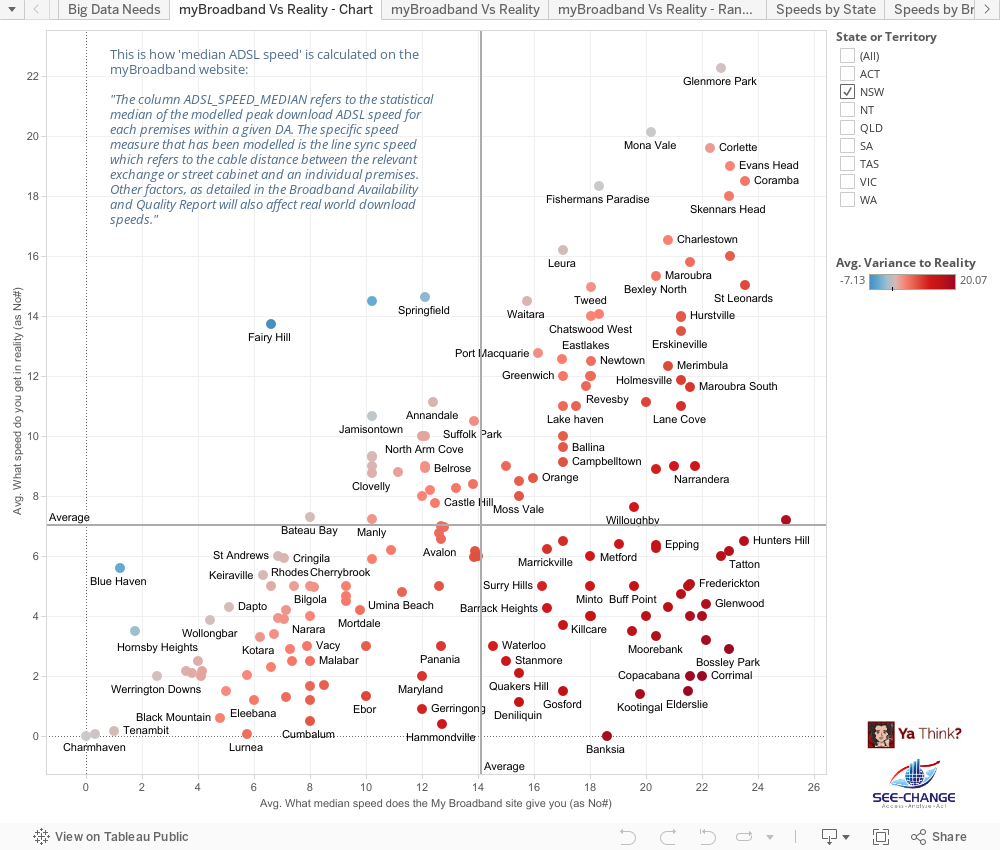
This is how ‘median ADSL speed’ is actually calculated on the much maligned “myBroadband” website:
“The column ADSL_SPEED_MEDIAN refers to the statistical median of the modelled peak download ADSL speed for each premises within a given DA. The specific speed measure that has been modelled is the line sync speed which refers to the cable distance between the relevant exchange or street cabinet and an individual premises. Other factors, as detailed in the Broadband Availability and Quality Report will also affect real world download speeds.”
So the fact that the actual signal gets slowed down by muddy, flooded pits and deteriorating, degraded copper is not reflected in these numbers. The fact that the signal is actually leaving the exchange via a ‘remote integrated multiplexor’ (sub-exchange), which slows the data down from 22mbps (ADSL2+) to 1.5-8mbps (ADSL1) is not reflected in these numbers. Talk about mis-representation of the data. It would appear that Australia’s entire broadband ‘strategy’ is being run along the lines suggested recently by Dogbert:

Dogbert on Dashboards
I was therefore very pleased to have stumbled across this crowdsourced survey of actual ADSL measurements, which formed the basis of a submission to the Senate Select Committee Hearing into the NBN (National Broadband Network – sometimes disparagingly referred to as the NBNNNNN i.e. “National Broadband Network – Not National Non-Network”). The team behind this excellent submission were more than willing to provide the raw data, which I turned into the following set of data visualisations:
When it comes to the Internet, everyone’s an ‘expert’ and everyone certainly has an opinion. However not all opinions turn out to be correct:

Hence the need for technologies such as Business Intelligence and Data Discovery tools, which aim to support “informed, fact-based decision making”. While that will not stop people from turning a blind-eye to the truth, particularly when it’s an “inconvenient” truth they would maybe rather deny, at least it gets the truth out there. (Hurrah for crowd-sourcing, social media and “Open Data”…)
 of averages")
The law (and danger) of averages
“Just think about the average, what use have they for you?” (Rush, “2112”)
I was at a presentation a while ago, the subject of which was economic data.
“Of course, the Central Coast has a higher than average aging population”, we were informed. Which made me smile, because not 10 minutes before, a colleague had commented to me (with actions), while we were discussing the danger of averages:
“I’ve got one hand in the fire, and one foot in the freezer, but on average my temperature is normal…”
Therein lies the problem. As I wrote in a previous post, the Sydney Morning Herald committed this sin when deducing that Central Coast workers were, in effect, lazy (or less hard-working) than workers in the Eastern Suburbs of Sydney, based on average weekly working hours for Potts Point compared to Central Cost suburbs such as South Kincumber and Patonga. The fact that the latter are predominantly retirement communities was completely missed by the journalist.
And similarly, with respect to the oft-repeated description of the Central Coast being “God’s waiting room”, a bit of analysis finds that, well, it depends…
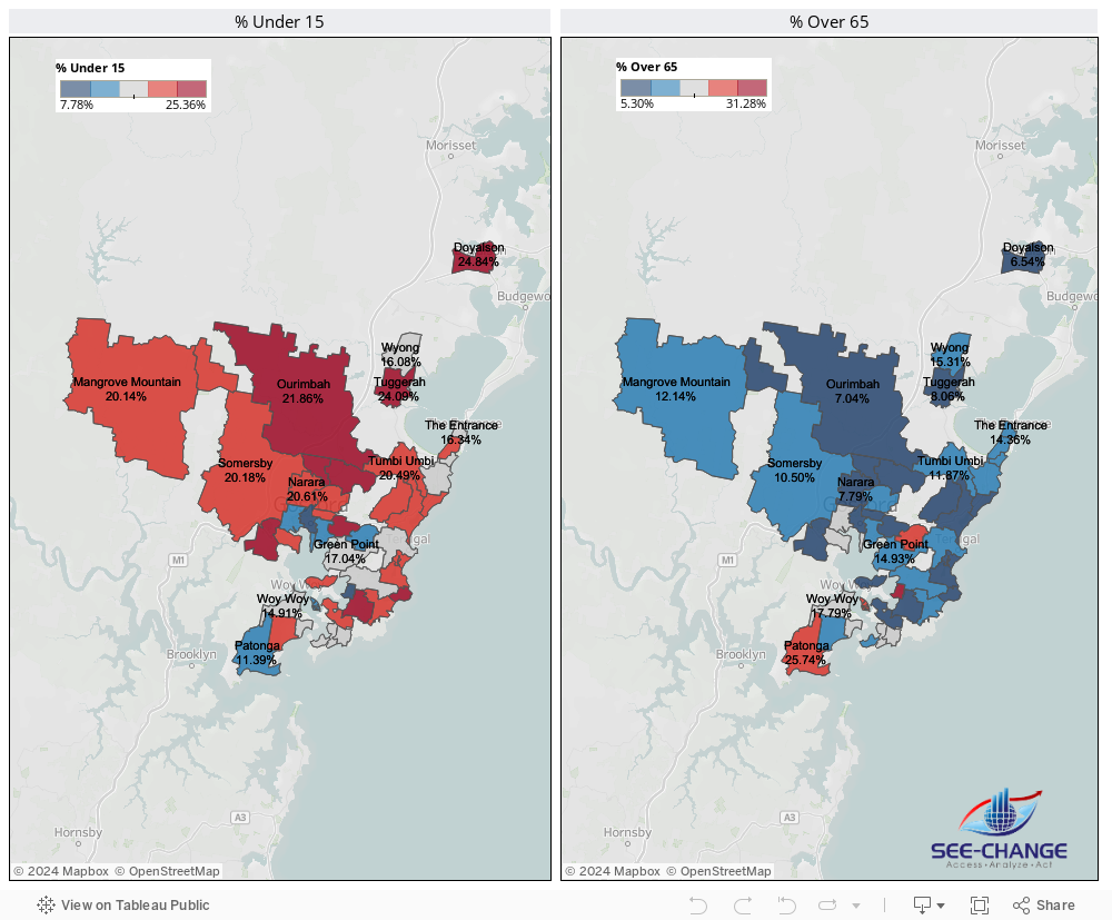
Drilling down on suburbs reveals dramatically different demographies, with some communities having a huge proportion of kids under 15 and a very low proportion of over 65s, for example.
So context is everything. While the media in particular use averages as a way of proving a point they know they want to make, a more pragmatic and objective approach is to recognise the potential for ‘judgemental bias’, particularly in the use of averages.

A/NZ BI Trends – Visualisation, Mobility and Self-Service
As part of several breakfast briefings I ran in 2011-12 on the topic of Visualisation, Mobility (Mobile BI) and Self-Service Reporting, I asked all participants a number of questions relating to their own internal BI/Reporting environments. This ran in conjunction with an email based survey, which received a very good (7%) response rate. Covering all industries and geographies across A/NZ, I received 230 responses in total. What became clear from the results was that BI, although assumed to be mature and pervasive, had not solved the Reporting problem in most organisations.
Here is a summary of the survey results, in Slide format.
We certainly need to heed the message of frustrated users, and focus on empowering the Knowledge Workers to solve complex business problems. Intuitively. And fast.
For anyone interested in my full survey results report, I can be contacted via email.
A/NZ Business Intelligence Survey
Recently, I attended the announcement of the Longhaus Pulse Research on BI and Analytics for 2011. Longhaus Pulse is the most comprehensive and regionally focused assessment of the Business Intelligence and Analytics market in Australia.
One area I found interesting was Longhaus Managing Director Peter Carr‘s observations around the evolution of the Business Intelligence market. Having worked in the BI industry for almost 20 years, this is something I can definitely relate to. Peter compared the current exciting trends around “Next Generation BI” to the prevalent trends of the 1980’s, 1990’s and 2000’s. Right now, Peter observed, trends around “Cloud” and Social Media are “putting the power back into the hands of the knowledge workers”. It’s certainly interesting that the “Next Generation BI” trends are all around Data Visualization, End User Self-Service, and Mobility (Mobile access to information). In other words, empowering the business user. (Funny, I thought we already had that in the 90’s…). Unfortunately, the 2000s became about “BI Standardization”, Portals and the like which were all heavily IT-centric. In the process, BI vendors perhaps lost sight of what BI was all about. Enabling users to get access to the Right Information, at the Right Time, to make Better Decisions. Longhaus talk about the “Digital Divide”, with BI technology outpacing end-user capability/need (just how many ‘Studios’ do I actually need to get access to my information???)
The consequence? Spreadsheets. And more spreadsheets. Spreadsheets everywhere.
The problem with this? Disparate data silos. Poor data integrity. Lack of an audit trail. Lost productivity. Inability to make timely, fact-based decisions.
Which brings me to my recent survey of BI trends in A/NZ. Covering all industries and geographies across A/NZ, I received 230 responses (7% response rate). What became clear from the results was that BI, although assumed to be mature and pervasive, had not solved the Reporting problem in most organisations. For example:
- Disparate Systems and Poor Data Quality are still views as the biggest challenged faced when relying on data to drive performance.

- 90% of respondents state that spreadsheets are still being used as part of the query & reporting process

- More than 1 in 4 spend 5 or more days each month preparing regular reports (ie one week of every month)

- Over 60% rely on others or have no ability to create their own ad-hoc reports

Most surprising of all, 40% are currently evaluating (or re-evaluating) their BI vendors, with a further 26% planning to do so within the next 12 months.
We need to heed the message of frustrated users, and focus on empowering the Knowledge Workers to solve complex business problems. Intuitively. And fast.
For anyone interested in my full survey results report, I can be contacted via email.

Your mailbox is almost full
Less than 2 months after I joined SAS Institute, I was somewhat surprised to see the following email in my inbox:
Your mailbox is almost full.
![]()
Your mailbox is approaching the allocated quota limit or has already reached it! Failure to act now may prevent you from sending, and in some cases, receiving any mail.
Conversely, my free Gmail account which I’d had for around 5 years was telling me:
“You are currently using 1229 MB (16%) of your 7491 MB”
In fact, since I started using email back in the mid-90s, I can’t recall ever having such a small email quota as 195Mb. So this got me to thinking…
195 megabytes = 0.1904296875 gigabytes
= 0.0001859664 terabytes
I think SAS has around 11,000 employees, so:
11,000 X 195 megabytes = 2,145,000 megabytes
= 2,094.7265625 gigabytes
= 2.0456314086 terabytes
So, if we were to see an increase in the allocated mailbox quota per employee to a more typical/common-sense 1Gb, this would give:
11,000 X 1 gigabytes = 11,000 gigabytes
= 10.7421875 terabytes
Now, I recently purchased a Seagate Blackarmor 6TB RAID NAS drive for my home network (cost around USD$730 on eBay). This has 4 hot-swappable 1.5TB Seagate drives, which in a RAID-5 configuration gives me around 6TB of useable storage. So, for purposes of storing SAS employee mailboxes, a 16TB NAS drive configured for RAID5 should give at least 12TB effective available storage. For example, I found the following on Amazon:
QNAP 16-Terabyte (16TB) Turbo NAS TS-809U-RP 8-Bay High Performance RAID 0/1/5/6/JBOD Network Attached Storage Server with iSCSI & Dual Redundant Power for Business – Powered by Western Digital WD20EADS 2TB 32MB Cache 7200RPM SATA/300 Hard Drive
This was listed at USD$4,595, which works out to 42c per employee..
Contrast that to the current scenario:
If we estimate a conservative 30 minutes per week wasted archiving emails @ an average employee cost to SAS of $50 per hour per employee = $275,000 per week lost productivity.
Let’s say we replace the network storage drive every year (call that preventative maintenance..) so:
As they say, “Do the Math”…
Footnote:
SAS Institute have subsequently increased the mailbox size limits for employees
Connect
Connect with us on the following social media platforms.